Suggested Jobs Redesign
March 15, 2020
To job seekers, ZipRecruiter had long been known as a job search engine. But as the company evolved, it became clear that our real strength was in our matching technology. The Suggested Jobs page was our primary surface for showcasing these matches, yet it had become a confusing mix of different job types and was built on a system that was difficult for engineers to evolve.
How could we redesign the Suggested Jobs page to give users a stronger sense of clarity and control, while also reducing engineering complexity?
Role
Lead Product Designer
Responsibilities
UX/UI, System Design, Product Strategy, Prototyping
Team
Nishok Chetty, Gerald Burns, James Messrie, Sandra Suttiratana, Mrinalini Garg
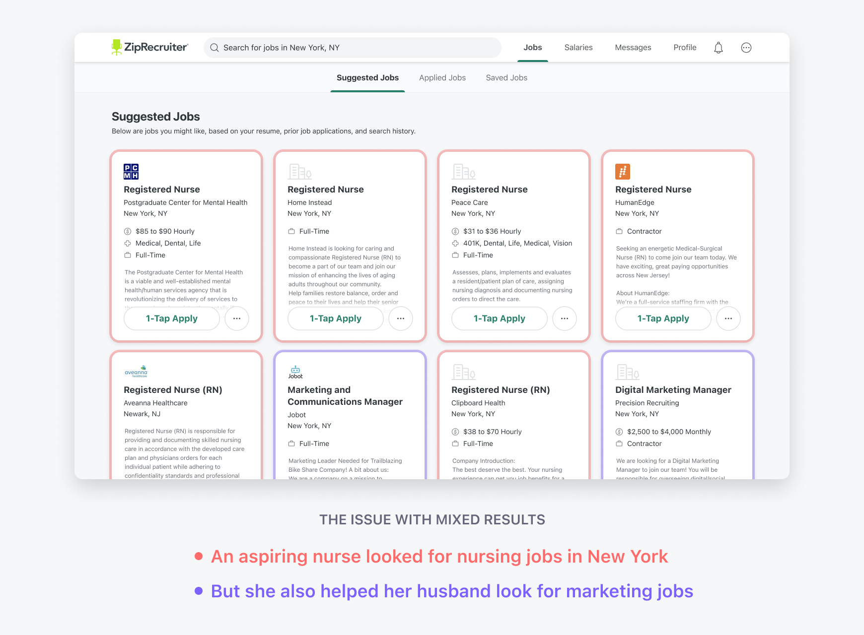
The Problem
Our existing page mixed directly suggested jobs with jobs from saved searches, creating a confusing experience. Users couldn't tell why they were seeing certain jobs, which eroded trust in our matching technology. On the technical side, the page was built on a rigid, legacy system that made it nearly impossible to test new ideas or add new features.
Our Vision
We set out with three core principles:
- Become the leader in job matching: Deliver a curated, browsable experience that showcases our matching prowess.
- Create a browsable home for content: Design a page that is engaging and easy to navigate.
- Build a flexible engineering system: Enable our teams to innovate and test new features quickly.
Features
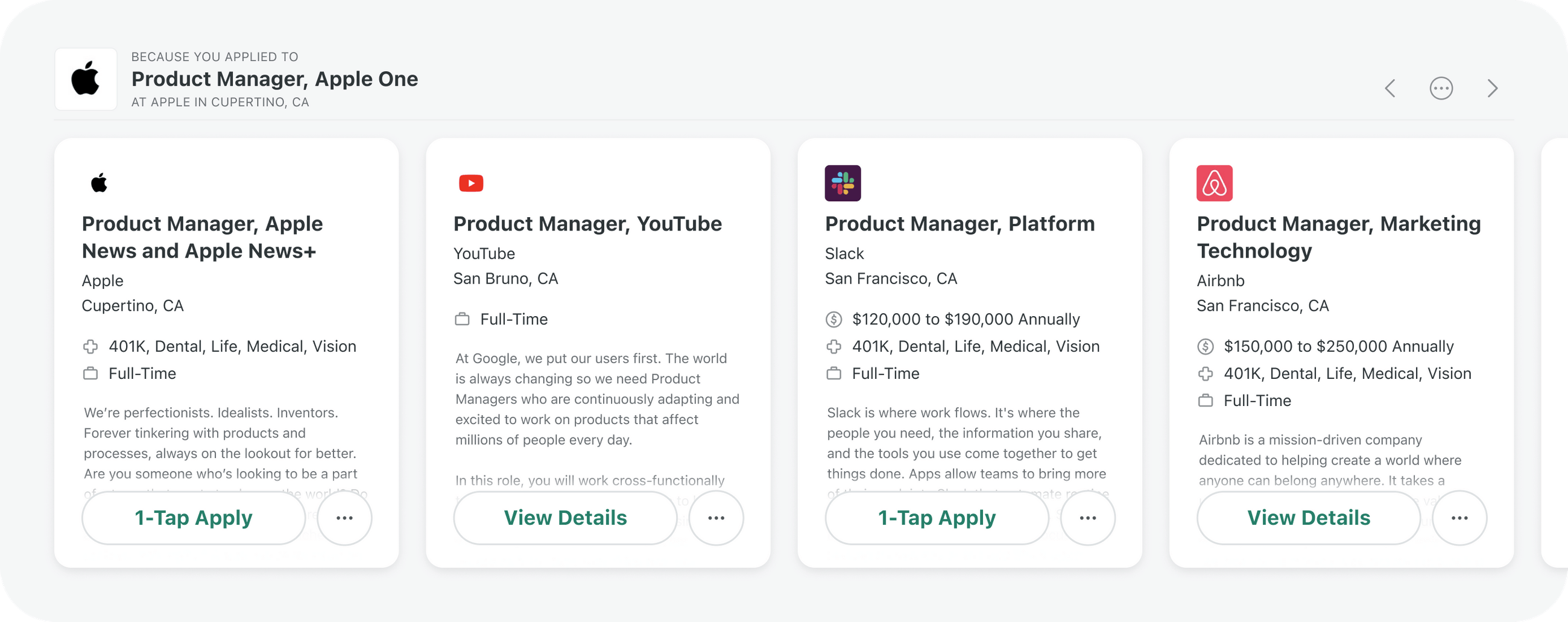
Grouping Content
We introduced carousels and versatile headers to group jobs logically, using subtle visual cues to help users understand the different sections at a glance.
Controlling Content
An action menu was added to each job group, allowing users to dismiss jobs or provide feedback like "not interested," giving them direct control over their recommendations.
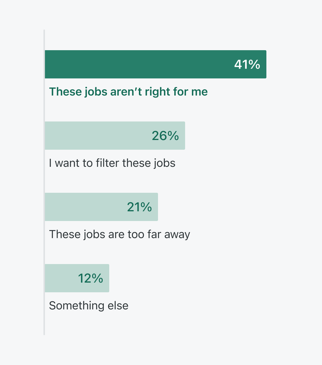
Research
Data from our satisfaction widget showed a clear need for improvement. User interviews confirmed that job seekers felt a lack of control and clarity. We also looked at content platforms like Netflix and Spotify to understand how they handled personalized recommendations and content discovery.
The Opportunity
The Suggested Jobs page was a high-traffic area, accounting for 12% of total job seeker clicks. Even small improvements could have a massive impact on the number of applications submitted, a key metric for the company.
Exploration
We explored various layouts, from single-row carousels to multi-row grids, and designed dynamic headers that could adapt to different content types. The action menu went through several iterations to find the right balance of functionality and simplicity.
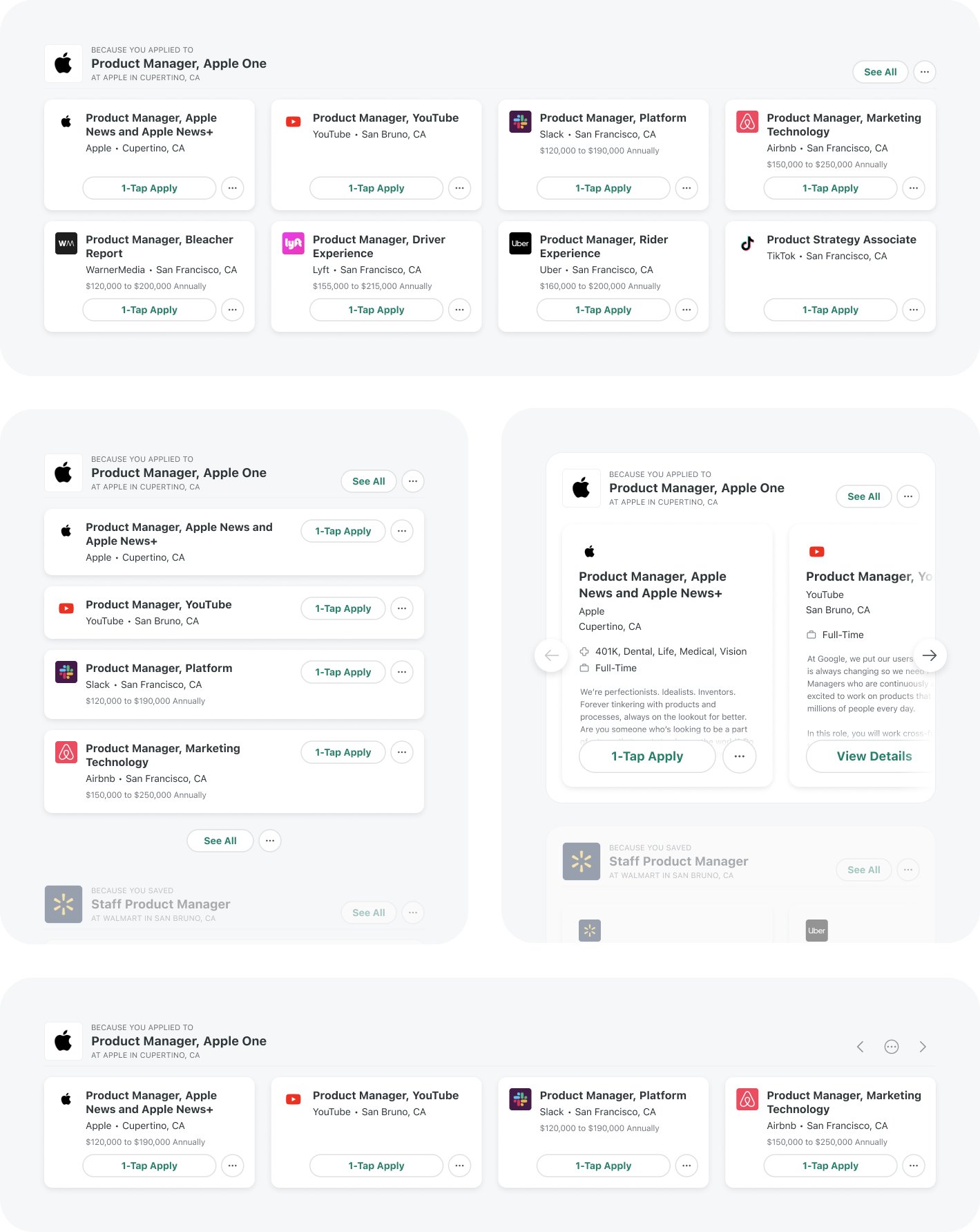 Suggested jobs group layout explorations
Group headers had to be dynamic, so as part of my process, I worked with Nishok to determine the breadth of different groups we might incorporate and explored a framework that could handle each.
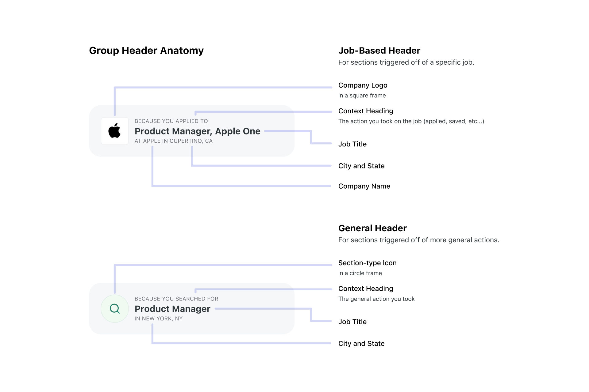 Suggested Jobs group header anatomy
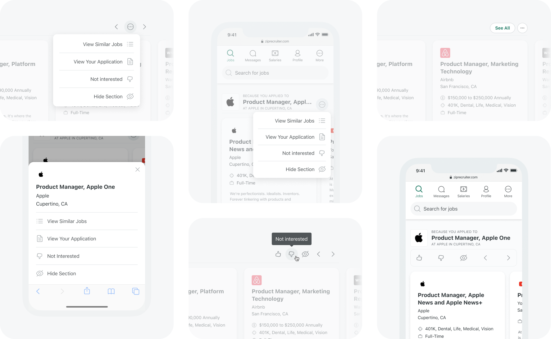 Suggested jobs action menu explorations
After gathering feedback from my team and showing Nishok the options, we narrowed in on the single-row card carousel and I began iterating on the carousel micro-interactions for both desktop and mobile. I prototyped and tweaked specifics like paging versus scrolling, dismiss group animations, and menu entrance and exit animations (shown above in the action menu section).
Results
The new design was a resounding success. We saw significant lifts across all key metrics:
- +22% clicks
- +8% applications
- +10% unique users engaged
- +8% satisfaction
Summary
This project was a powerful reminder of several key principles:
- Listen to your users: Their feedback is a goldmine.
- Look for low-hanging fruit: Small changes in high-traffic areas can yield big results.
- Think in systems: A flexible design system is crucial for long-term innovation.
By focusing on user clarity and control, we not only improved the user experience but also created a more robust and scalable platform for the future.